Last Updated: 27th February 2025.
The Color Creator is one of the more underrated functions from Olympus. The article was written to give M43 photographers a new perspective on this unique function. The Color Creator multitasks as an innovative tool to adjust the color and ambiance of our photos while teaching us more about color and creative techniques. For example, the Enhanced Raw Format makes it possible to use the Color Creator in the field and keep or deselect the results in Workspace.
The Color Creator and Color Adjust tools are unique to Olympus and give us a broader range of color and creative options. I appreciated the uniqueness of these features more when I saw how much Fuji photographers do with fewer options. The Color Creator reminds me of Fuji's chrome effect.
Try the following exercise with your Color Creator.
Select a similar image from your image collection to create the above color and ambiance for your photos. Raw files work better because the Color Creator is unavailable for JPEGs. Open the raw file in Workspace and select the Color Creator from the Picture Mode menu. The Color Creator was available for all 16MP and 20MP (OM-D and PEN) Olympus cameras.
Start by identifying the colors in your image as you open the image. Use the Adjust Color function to find the colors. Move the mouse over the image and follow the highlighted colors on the color sliders (below). The colors below the mouse pointer will be highlighted on the color sliders.
I identified yellow and blue with the above method and targeted yellow in the above photo. Be aware of unnecessary color casts with colors not found in the photo. That said, the Color Creator is good for removing color casts. Photographers might also prefer special color effects. For example, most images benefit from warm colors. I like to start with orange to evaluate my photos.
This is an example of using blue (the opposite of yellow)
A brief explanation of the Olympus Color Creator
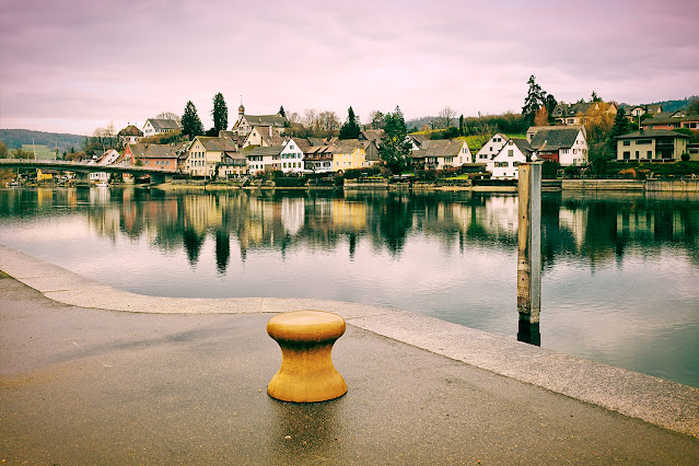
The Color Creator is my go-to function for creative color effects, and I prefer the Adjust Color tool for Color Profiles. The conditions for the above image were a late afternoon sundown scene. It's good to practice selecting the best time of day and photo opportunities (painting with light) for the Color Creator. The next step in the above example was targeting blue with the Color Creator.
The above illustration shows the Color Creator (CC) to the right and the Color Wheel (left). The colors in the Color Wheel mimic the colors in the Color Creator. The primary colors are RGB in the Color Wheel. It helps to keep a copy of the color wheel in your pocket or on your phone.
A basic explanation of how the Color Creator works.
Summary notes for the Color Creator (CC):-
- Always divide the CC into halves, the Color Pointer half and opposite colors.
- Start adjusting the targeted colors (color pointer) and next the opposite colors.
- The vivid "slider" changes color while the opposite side desaturates the colors.
- The image changes to B&W (desaturate) when the vivid slider is in the center.
- Except for the B&W images, the colors to the left/right are impacted the least.
Pen-F with the 17mm f1.8 - ISO200, f5.0, 1/1000 - Color Creator (11:0) - Opposite colors with desaturated greens.
The Color Creator is good for creating positive reactions from your audience. Regular practice and hands-on experience are essential for having good results with the Color Creator. This
video talks about color harmonies and how they can be used to change the audience's mood.
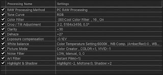
You can tweak your Color Creator settings in Workspace with the Enhanced Raw File. Activate the Color Creator in WorkSpace and see the color settings you used in the field. See my article on the Enhanced Raw Format and how to activate your camera settings in Workspace.
Example 1 (Workspace, Color Creator, and layers in Photoshop)
- I targeted orange/red to simulate an analog film look with Workspace
- I used the Color Creator and Color Filters at the same time in Workspace
- I exported the image to Photoshop and applied Soft Blending in Layers
Olympus Pen F with 9-18mm f4-5.6 lens, ISO200, 1/1250, f5.6
Example 2
- Color Creator, Highlights/Shadows, Tone Curves, and PS
- I targeted magenta with +1 Vivid in the Color Creator
- I used the Soft ART filter to create a specific ambiance
- I used layers and blending modes to add a little definition
- See my main Workspace adjustments below the image
Olympus EM1 II with 35-100m f2.8 Lumix - ISO200, f2.8, 1/800
Example 3
- Pop ART Filter, Color Creator, and Color Filters
- See my Workspace settings below the image
- I used Photoshop and Blending Modes
Olympus Pen F with 12mm f2.0 Lens - ISO800, f4.5, 1/80
Example 4
This is an example of editing two Enhanced Raw Files with Workspace. How does one target colors in Workspace? Start by identifying the colors and their opposite colors in the image. Focus on them and use the Color Creator to create color and ambiance effects. Use the Tone Curves function in Workspace as a curves function or complementary colors to the Color Creator. A third level of augmenting the Color Creator is Workspace Presets. All these benefits from gaining more experience...
The two examples below demonstrate the power of the Color Creator.
The first raw image
The second raw image
The above example is interesting because I purposely increased the vividness to highlight the colors in the scene. I do not typically saturate colors this much. I had to adjust the sky because the Color Creator desaturated the blues (the opposite color). I used my "WB Preset" to correct the blues. This technique of combining two functions makes Workspace more interesting.
Example 5
- This example uses multiple filters in Workspace
- Practice with opposite colors and color harmonies
- I started with the Instant Film ART Filter because I wanted a film look
- I used opposite colors and color harmonies with my different filter settings
- See my editing steps and the different filters I used in WS for this image
What do we learn from the above examples?
- Work with colors found in the scene or the image
- It's good to use harmonizing colors - See this article
- The concept of working with opposite colors is key
- Practice using multiple color functions in Workspace
Additional editing steps:-
- I adjusted my final contrast with the highlights/shadows (curves) function.
- ART Filters work great with the Color Creator and Highlights/Shadows
- I use the Unmask Filter in Workspace or Smart Sharpen in Photoshop
- I often do my final brightness, contrast, and cropping in Photoshop
The Color Creator is a creative tool. Use it as often as possible in the field. Also, practice with the Color Creator in WorkSpace, and try the Color Creator with WB (Preset) combinations.
Additional information:-
- For more about Enhanced Raw Files and Live View, link
- Editing images in Live View mode with WorkSpace - link
- Go to the WorkSpace Tips article for several tips - the link
Olympus Pen F with 25mm f1.8 Lens - ISO200, f4.5, 1/500 (only i-Enhance)
There is a general misunderstanding about iEnhance in Picture Mode. Search for more information if you haven't. Olympus added its most advanced imaging technologies to the iEnhanced Picture Mode. It has three intensity levels with instantaneous benefits for your camera and Workspace.
Olympus Pen F w 25mm f1.8 Lens - ISO200, f4.0, 1/1000 (CC 19:0, EC=-2, Saturation +0.4, Curves 2:-1:-1)
Olympus Pen F w 25mm f1.8 Lens - ISO200, f4.5, 1/500 (CC 3:0, Curves 2:-0:-2)
Olympus Pen F w 17mm f1.8 Lens - ISO200, f5.6, 1/640 (WB Shadows & A-3, CC 3:0, Curves -4:-3:0)
Olympus Pen F with 75-300mm Lens - ISO200, f6.7, 1/400 (Raw edited with PhotoLab 4 & PS)


No comments:
Post a Comment